

KILONA
Kilona had a clear vision a conscious lifestyle brand rooted in Ayurveda, global design, and sustainably sourced materials. But before a single product went live, they needed a brand identity strong enough to build a store around.
Visual Identity
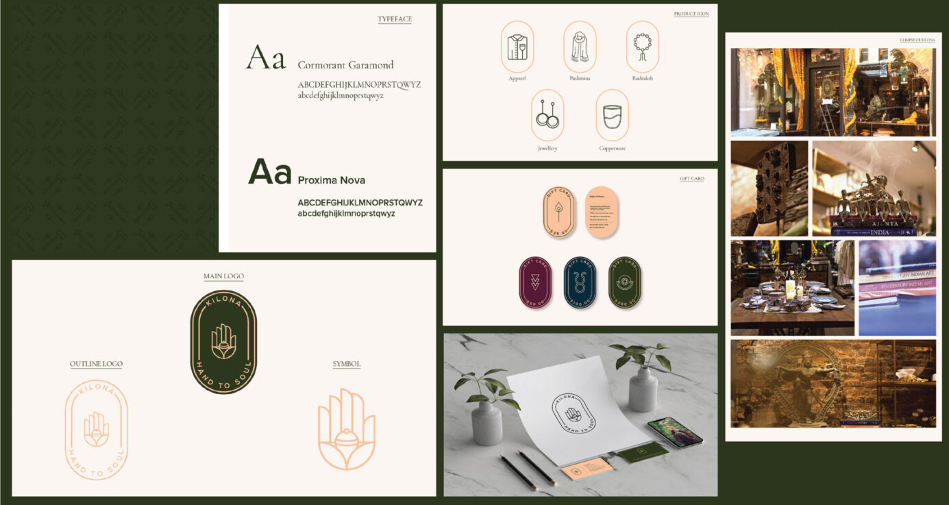
Logo, colour palette, and typography rooted in earthy, Ayurvedic calm.
Brand Voice
Tone-of-voice guide blending ancient wisdom with modern, global clarity.
Packaging Direction
Sustainable materials brief and packaging layouts aligned to brand values.
Store-ready Assets
Social templates, profile assets, and a launch-ready brand kit for the store setup.
HOW WE APPROACHED IT
Identity design: Created a visual system that felt ancient and modern simultaneously — earthy tones, clean geometry, natural textures.
THE OUTCOME
Kilona launched with a brand that looked like it had existed for years. The identity gave the store instant credibility, a clear point of difference in the crowded wellness space, and a visual language that could stretch from Instagram to packaging to retail without losing its soul.